

Autodesk Application Icons
Posted: June 30, 2013
Post subject: Autodesk Application Icons
Post subject: Autodesk Application Icons
Autodesk Applications Icon Set Version 1.2
Version 1.2 Update: I brightened them in this version cause I noticed that they were rendered somewhat too dark so I adjusted them and now they look brighter, the way they are supposed to look. I noticed it clearly when I placed some beside my other icons in my application launcher, now they look more like the other icons.
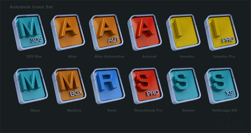
This is a set of 12 icons for Autodesk applications that I made in 3D. I noticed that there are not that many good quality icons for Autodesk applications out there and I did not like that much the new designs that they were using for the current generation of them in 2013 and 2014 programs. I'm not saying that they are ugly or unprofessional or anything like that, it is just that they are a bit too abstract for my taste. There are a few good quality icons for some of their programs out there in the web but they are inconsistent, made of different styles that do not match at all and I wanted to create a matching set that looked very modern so I decided to do it.
I wanted them to be done in a 3D program instead of doing them in illustration style cause that is what most of Autodesk applications are about, they have mainly 3D design and CAD programs so that is why I choose this style. Also I wanted them to have a modern industrial look and the design I made also reflects a lot the style of the newer IPhones cause they are quite the current fad. The font I used is one that has a style very similar to Autodesk's new logo cause it is very nice although this font I used has some letters that look different cause their new logo is a custom font design job.
It has Windows, Mac and Png versions. The Windows and Mac versions include icons from 16 to 256 pixels in size. The Png set includes images up to 512 pixels in size so if you want to modify the Mac icons to include a 512 pixel size you can do it if you have a program that can add the 512 pixel size Png to the icns file. I can not do it cause my icons program can only do it to a maximum of 256 pixels. You can modify it at least for your own personal use. I hope that you enjoy them.
You can download them here for free in Deviantart:
http://fav.me/d6be05z
Or as an alternative in my folder in Mediafre:
http://www.mediafire.com/folder/cuc82t8l3b093/Public_Files
Version 1.2 Update: I brightened them in this version cause I noticed that they were rendered somewhat too dark so I adjusted them and now they look brighter, the way they are supposed to look. I noticed it clearly when I placed some beside my other icons in my application launcher, now they look more like the other icons.
This is a set of 12 icons for Autodesk applications that I made in 3D. I noticed that there are not that many good quality icons for Autodesk applications out there and I did not like that much the new designs that they were using for the current generation of them in 2013 and 2014 programs. I'm not saying that they are ugly or unprofessional or anything like that, it is just that they are a bit too abstract for my taste. There are a few good quality icons for some of their programs out there in the web but they are inconsistent, made of different styles that do not match at all and I wanted to create a matching set that looked very modern so I decided to do it.
I wanted them to be done in a 3D program instead of doing them in illustration style cause that is what most of Autodesk applications are about, they have mainly 3D design and CAD programs so that is why I choose this style. Also I wanted them to have a modern industrial look and the design I made also reflects a lot the style of the newer IPhones cause they are quite the current fad. The font I used is one that has a style very similar to Autodesk's new logo cause it is very nice although this font I used has some letters that look different cause their new logo is a custom font design job.
It has Windows, Mac and Png versions. The Windows and Mac versions include icons from 16 to 256 pixels in size. The Png set includes images up to 512 pixels in size so if you want to modify the Mac icons to include a 512 pixel size you can do it if you have a program that can add the 512 pixel size Png to the icns file. I can not do it cause my icons program can only do it to a maximum of 256 pixels. You can modify it at least for your own personal use. I hope that you enjoy them.
You can download them here for free in Deviantart:
http://fav.me/d6be05z
Or as an alternative in my folder in Mediafre:
http://www.mediafire.com/folder/cuc82t8l3b093/Public_Files
Posted: November 01, 2013
Post subject:
Post subject:

PixelOz, nice icons. But they are too similar.
For example 3ds max icon is very similar to Maya icon. So for an artist that uses both it's kind of inconvenient.
For example 3ds max icon is very similar to Maya icon. So for an artist that uses both it's kind of inconvenient.
Posted: January 11, 2014
Post subject:
Post subject:
I see your point and I also see that it is mainly between those two icon cause they have the same color. One of the things that caused this is the fact that they have the same colors, particularly those two which forcefully also have the same letters. I did think about giving them different colors but I wanted them to have the same colors that Autodesk is using for the current crop of their programs and so my solution was to include the 3DS letters below the M but it seems that for some people that is not enough.
Perhaps I will make an alternate Max icon like that that I will also include in the pack, we will see. Perhaps a solution would be to change the M in the 3DS Max icon to a number 3 and then make the small letters MAX cause obviously I cannot put 3DS up there but the 3 would fit.
Perhaps I will add the whole letters SMOKE below the S (I think that they will fit) to also separate the Smoke icon more from the XSI icon cause they also have the same letters and same colors. As for the rest some do have the same colors but at least different letters and that helps a lot. I think that that could perhaps improve them somewhat.
Posted: February 08, 2014
Post subject:
Post subject:
The icon pack has been updated a little bit, check it in Deviantart at the same address.